A LOOK BACK | Best Modern Era Jerseys In The NASL

Every new season comes with number of important questions. How will the team do? What will the roster look like? Which players are going to step up?
But one of the most frequently asked questions from fans has absolutely nothing to do with the game itself. And that of course is: What will the jerseys look like?
For “kit nerds” alike, seeing their favorite teams’ jerseys unveiled is one of the biggest moments of the year. With that idea in mind, we thought a trip down memory lane was in order.
Here is a look at some of the best jerseys of the NASL Modern Era:
NSC Minnesota Stars (2011) – A team that was typically clad in blue and gold, the NSC Minnesota Stars went bluish-gray and orange for their alternate jerseys in 2011. While a pair of other teams (Carolina RailHawks and Puerto Rico Islanders) wore orange as well, using the bluish-gray tops stood out above some of the other jerseys around the league at that time.
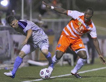
San Antonio Scorpions (2012) – The Scorpions had an interesting alternate jersey of their own in 2012. Featuring Morgan’s Wonderland prominently on the front, this jersey used a color that not many have tried around the NASL – purple. The use was understated - with just one stripe across the front - but it made for a clean and sharp look. The Scorpions organization dedicates itself to a great cause – helping those with special needs – and this jersey was a great way to highlight it.

Puerto Rico Islanders (2012) – Guess what? Another alternate jersey makes the list – this time from Puerto Rico. Using its popular orange coloring as a pillar for the design, La Naranja added white stripes to create one of the best Modern Era looks. Maybe the jersey is something Puerto Rico FC, which begins play in the 2016 Fall Season, will use as inspiration.
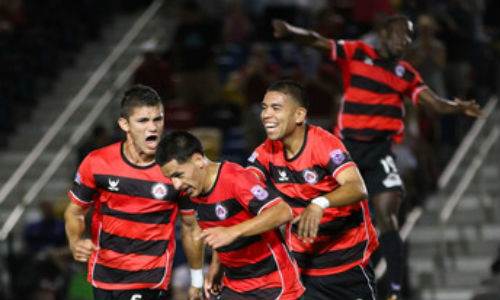
Atlanta Silverbacks (2013) – Atlanta’s home jerseys featured the red and black that has always been associated with the Silverbacks, but used the colors in a very sharp hoop application. With solid black shorts and socks, the hooped jerseys spoke for themselves. It’s a look that the Silverbacks have brought back for their 2015 jerseys as well.
Fort Lauderdale Strikers (2013) – The Fort Lauderdale away jerseys weren’t overly complicated, but some subtle designs made it a great one. Skinny red hoops were used for the tops and then the yellow and red trimming on the otherwise solid black shorts were a nice touch.

FC Edmonton (2014-present) – After a relatively simple jersey the year before, the Eddies’ 2014 version, which is still used now, upped the ante. With a white stripe and some black in the top half, Edmonton had already added some more flare, but the white slashes at the bottom give it a little bit extra to make for a nice combination with the Eddies’ blue.
Carolina RailHawks (2014) – While it may have only been used for a game last season, this RailHawks alternate jersey stuck out from the rest. With the Ronald McDonald House displayed as the jersey “sponsor,” the dark blue tops made for a nice contrast with the white shorts and socks.

Ottawa Fury FC (2014) – In its inaugural season, Ottawa had a quality jersey to go with it. Utilizing red and white, Fury FC split them in half for its away edition. Adding something a little different than what has been used in the NASL made for a strong jersey debut for the Canadian side.

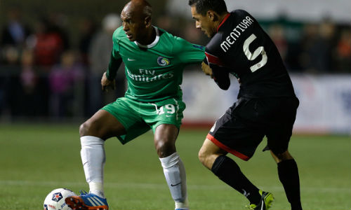
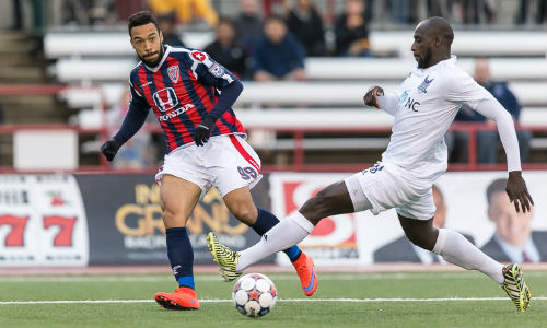
New York Cosmos (2015) – The Cosmos brought back a color that goes back to its Golden Era days – blue. The royal blue alternate jersey – with classic numbering - stands out as one of the best offerings of the current season.

Indy Eleven (2015) – How can you represent your home city? Incorporating the flag is one way to do it, and that is what Indy Eleven decided to do with its alternate kit. The flag motif on the shoulders is coupled with red and blue stripes, making for a nice, clean look, and a superb nod to its supporters for the second-year club.
Tampa Bay Rowdies (2015) – Typically known for hooped sleeves, the Rowdies took the concept and ran with it for their current home kits. While they may have been a shock for traditionalists, the new jerseys have shown very well on the pitch. Perhaps the Rowdies wanted to steal a little thunder from long-time rival Fort Lauderdale?
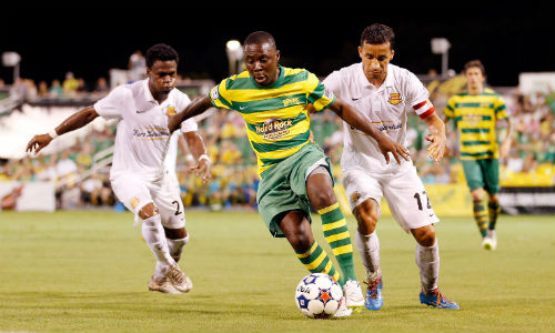
Jacksonville Armada FC (2015) – After debuting with a clean, basic jersey look, the Armada FC kicked it up a notch for the second half of the season. Using a style similar to that of the U.S.’s “bomb pop” jerseys, Jacksonville’s newest look makes good use of gold, which contrasts nicely with the navy blue and white at the top half of the shirt.

Minnesota United (2015) – Last on this list, but certainly not the least is the updated version of what is becoming an iconic jersey for Minnesota. Using a more charcoal gray this year, the loon wing is still the focus. Also, while it’s not pictured here, the blue lettering and numbering in the back adds another element to Minnesota’s latest offering.

And some classics
For those that love tradition, it would be remiss to omit some of the jerseys that bridged the gap between the Golden and Modern Eras.
Tampa Bay Rowdies (2013) – Referenced above, the Rowdies showcased the hooped sleeves in the 2013 edition. Also of note are the two stars on the Rowdies’ logo – one of those was added after the club picked up its second title the year prior.

Fort Lauderdale Strikers (2013) – The Strikers’ jersey has been synonymous with the hooped look, and the top from 2013 resembles those from the past.

New York Cosmos (2013) – It was the club’s reboot season in 2013, but the classic Cosmos look remained the same. While the green jerseys were typically worn with white shorts that season, the all-green look, which is used more often now, brings back several Cosmos memories.